NPO3 — Rebrand

My role
Creative Direction
Design Lead
Project outline
Brand Identity
Brand Design
Broadcast
Motion Identity
Client
Total Design / NPO
Transforming the national youth channel of Dutch public television into a 360 brand
To help NPO3 stand out as a brand in a changing and challenging media landscape, we put the emphasis on cross-platfrom visibility, and navigation to on-demand content.
In this landscape the NPO is publicly funded by taxpayers. Keeping this in mind I created a clean, functional and no fuss identity, that builds on the Dutch Design tratition. For this rebrand I was invited by Woodwork to join them as design lead.
Sizzle reel
Sizzle reel
Simplicity. Clarity.
Simplicity. Clarity.
With an increased emphasis on navigation to online and on-demand content.
With an increased emphasis on navigation to
online and on-demand content.
With an increased emphasis on navigation to
online and on-demand content.
With an increased emphasis on navigation to
online and on-demand content.
With an increased emphasis on navigation to
online and on-demand content.
strategy
& identity
strategy
& identity
A strong focus on cross-platform visibility and navigation, that connects and interacts with the target audience.
This stategy dictated the Visual Identity at all levels and touchpoints.
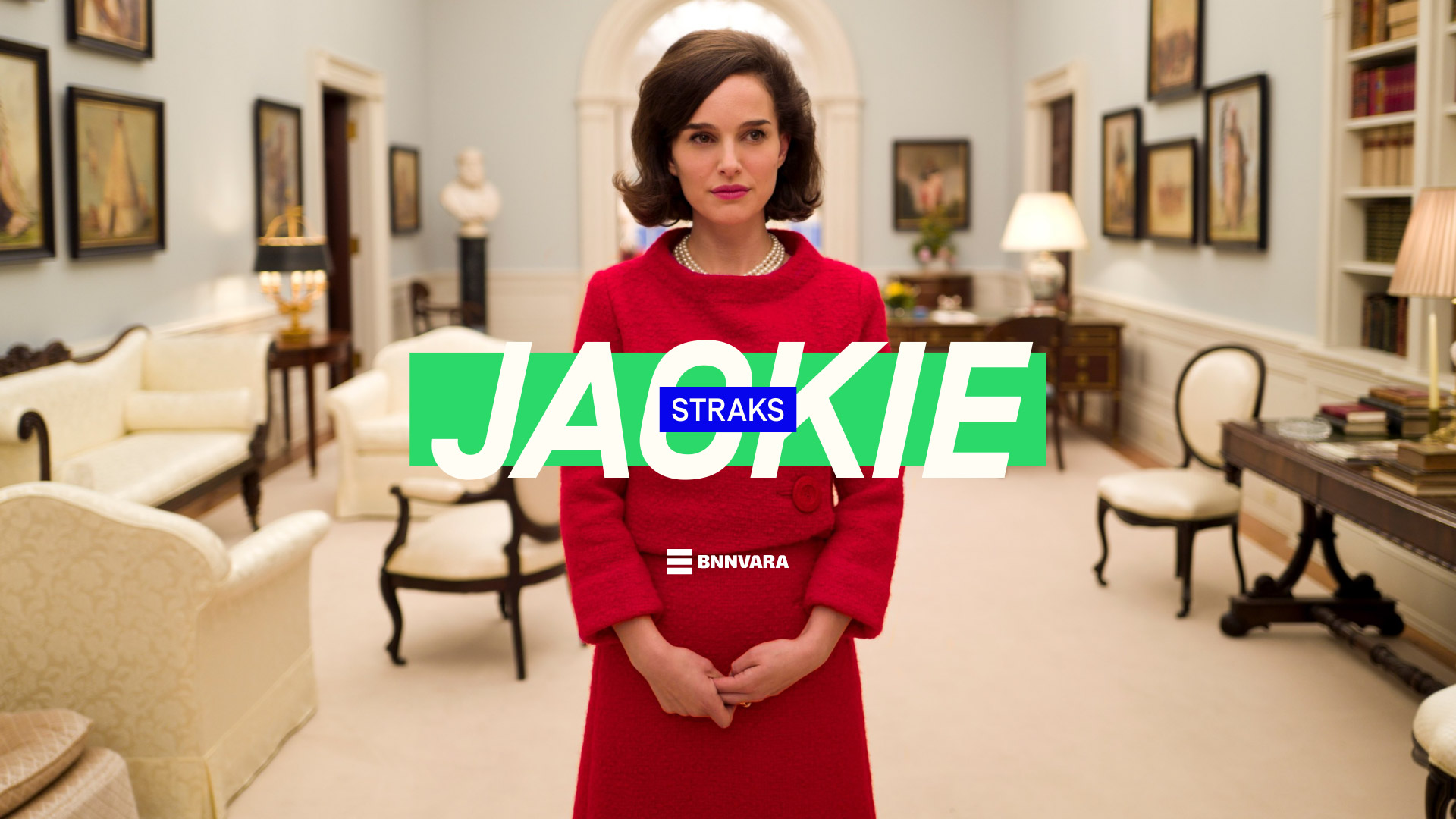
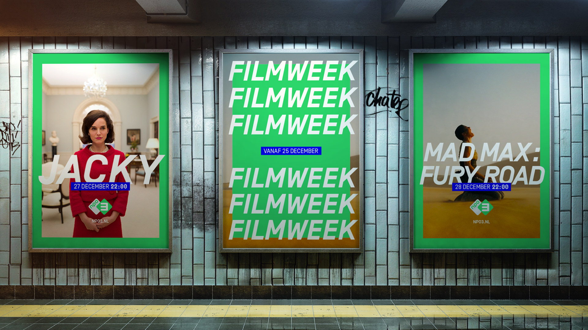
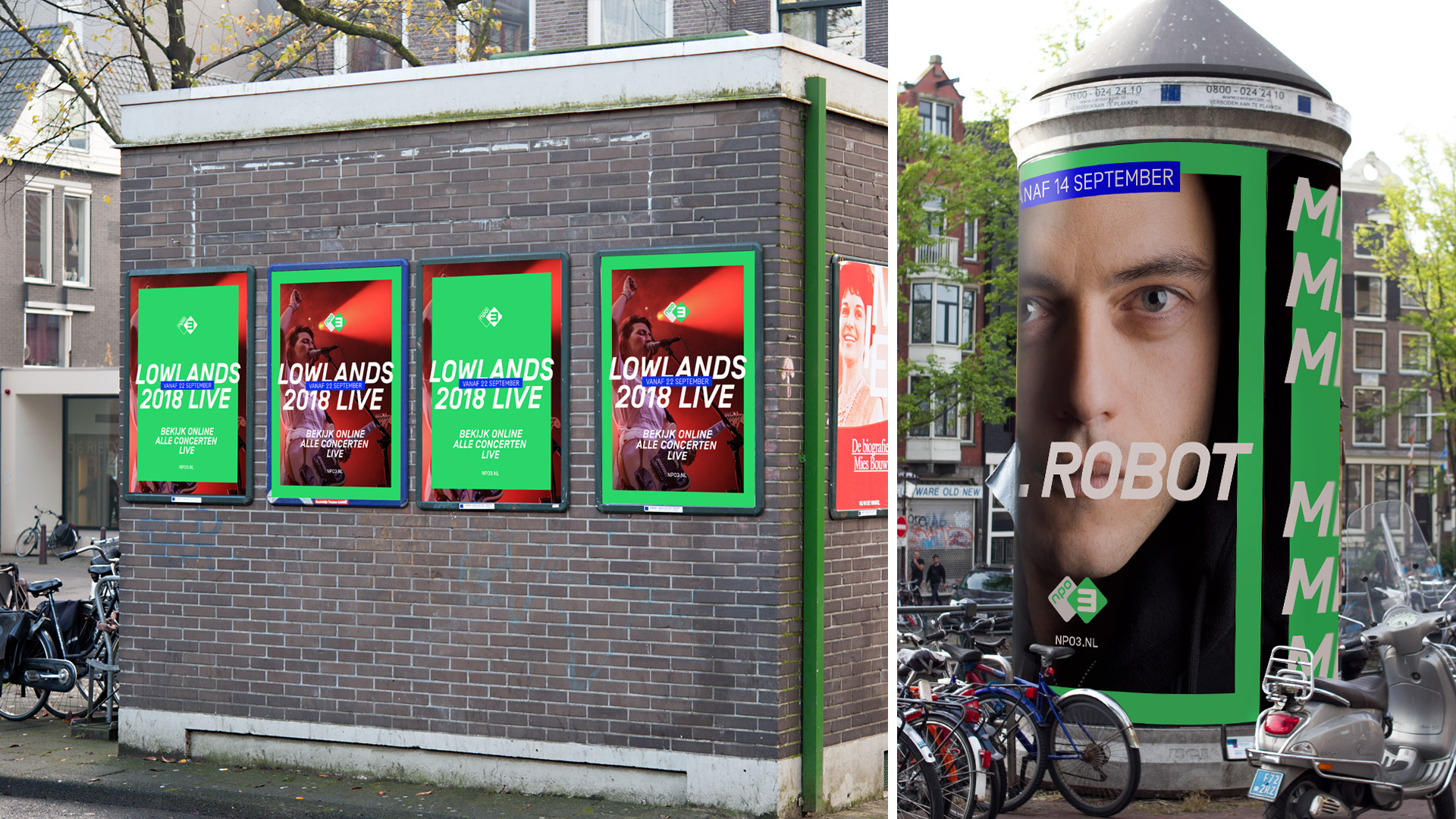
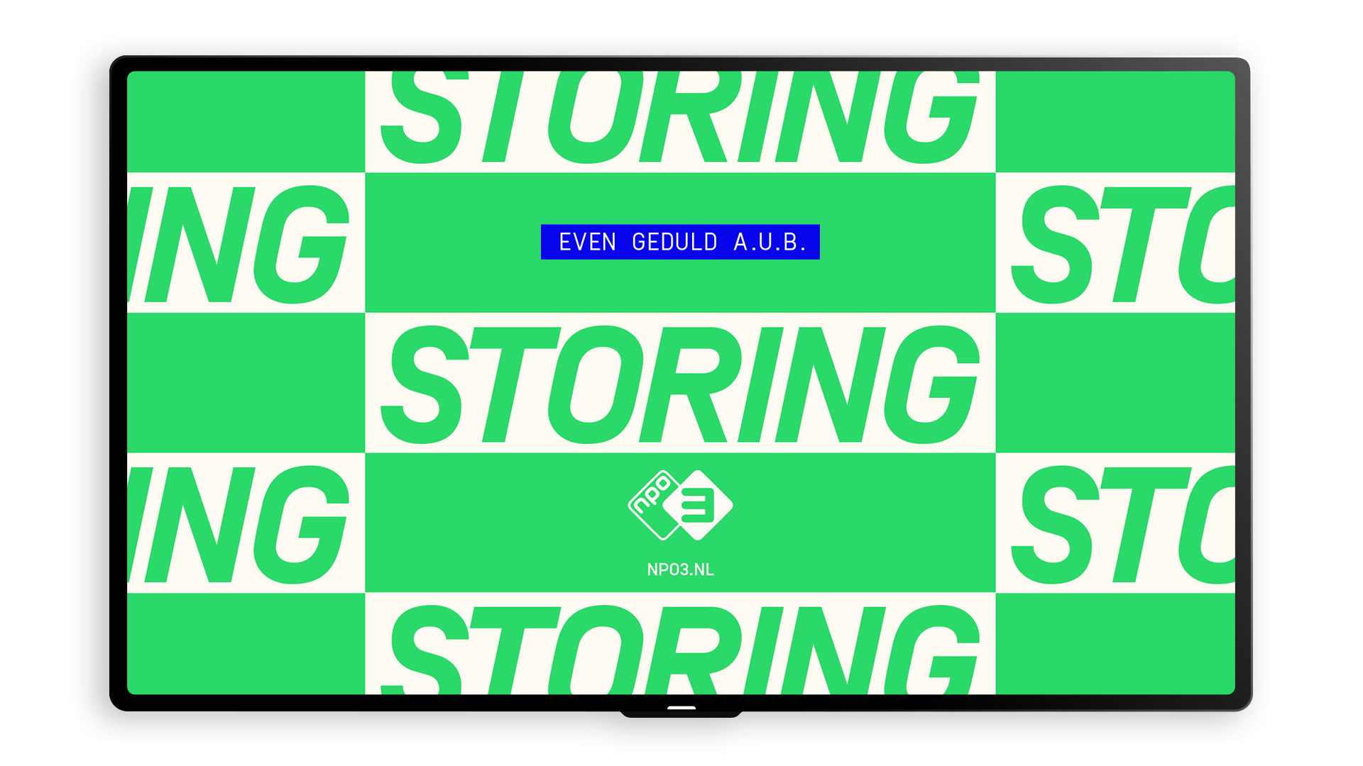
As the NPO3 programming is provided by various public broadcasters, a tool to visually claim the content across platforms was developed to increase visibility —and thus strengthen the NPO3 brand.
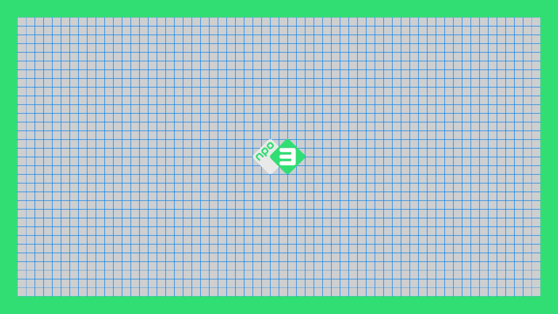
The literal green NPO3 frame helps the viewer to easily identify —and navigate to their favorite content on all devices.
A strong focus on cross-platform visibility and navigation, that connects and interacts with the target audience.
This stategy dictated the Visual Identity at all levels
and touchpoints.
As the NPO3 programming is provided by various public broadcasters, a tool to visually claim the content across platforms was developed to increase visibility —and thus strengthen the NPO3 brand.
The literal green NPO3 frame helps the viewer to
easily identify —and navigate to their favorite content
on all devices
A strong focus on cross-platform visibility and navigation, that connects and interacts with the target audience. This stategy dictated the Visual Identity at all levels and touchpoints.
As the NPO3 programming is provided by various public broadcasters, a tool to visually claim the content across platforms was developed to increase visibility —and thus strengthen the NPO3 brand.
The literal green NPO3 frame helps the viewer to easily identify —and navigate to their favorite content on all devices.
A strong focus on cross-platform visibility and navigation, that connects and interacts with the target audience.
This stategy dictated the Visual Identity at all levels and touchpoints.
As the NPO3 programming is provided by various public broadcasters, a tool to visually claim the content across platforms was developed to increase visibility —and thus strengthen the NPO3 brand.
The literal green NPO3 frame helps the viewer to easily identify —and navigate to their favorite content
on all devices.
A strong focus on cross-platform visibility and navigation, that connects and interacts with the target audience.
This stategy dictated the Visual Identity at all levels and touchpoints.
As the NPO3 programming is provided by various public broadcasters, a tool to visually claim the content across platforms was developed to increase visibility —and thus strengthen the NPO3 brand.
The literal green NPO3 frame helps the viewer to easily identify —and navigate to their favorite content on all devices.

colour &
typography
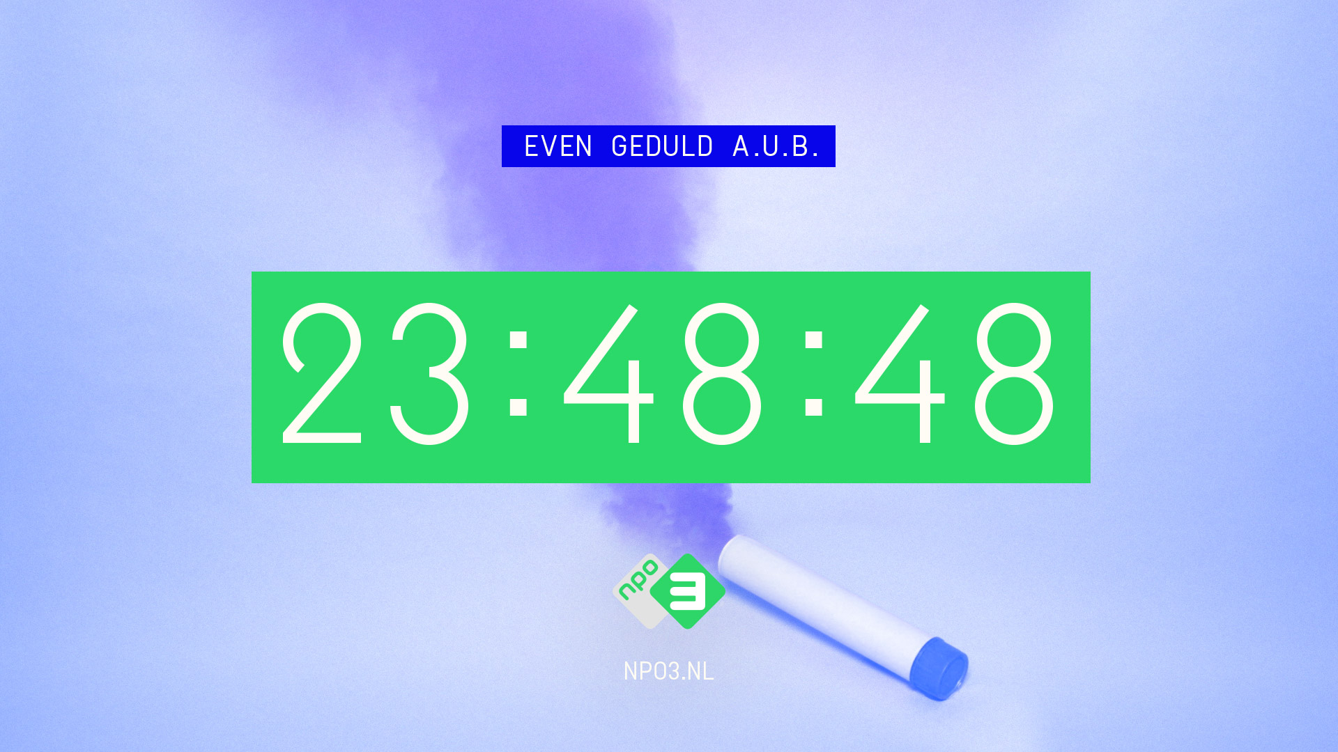
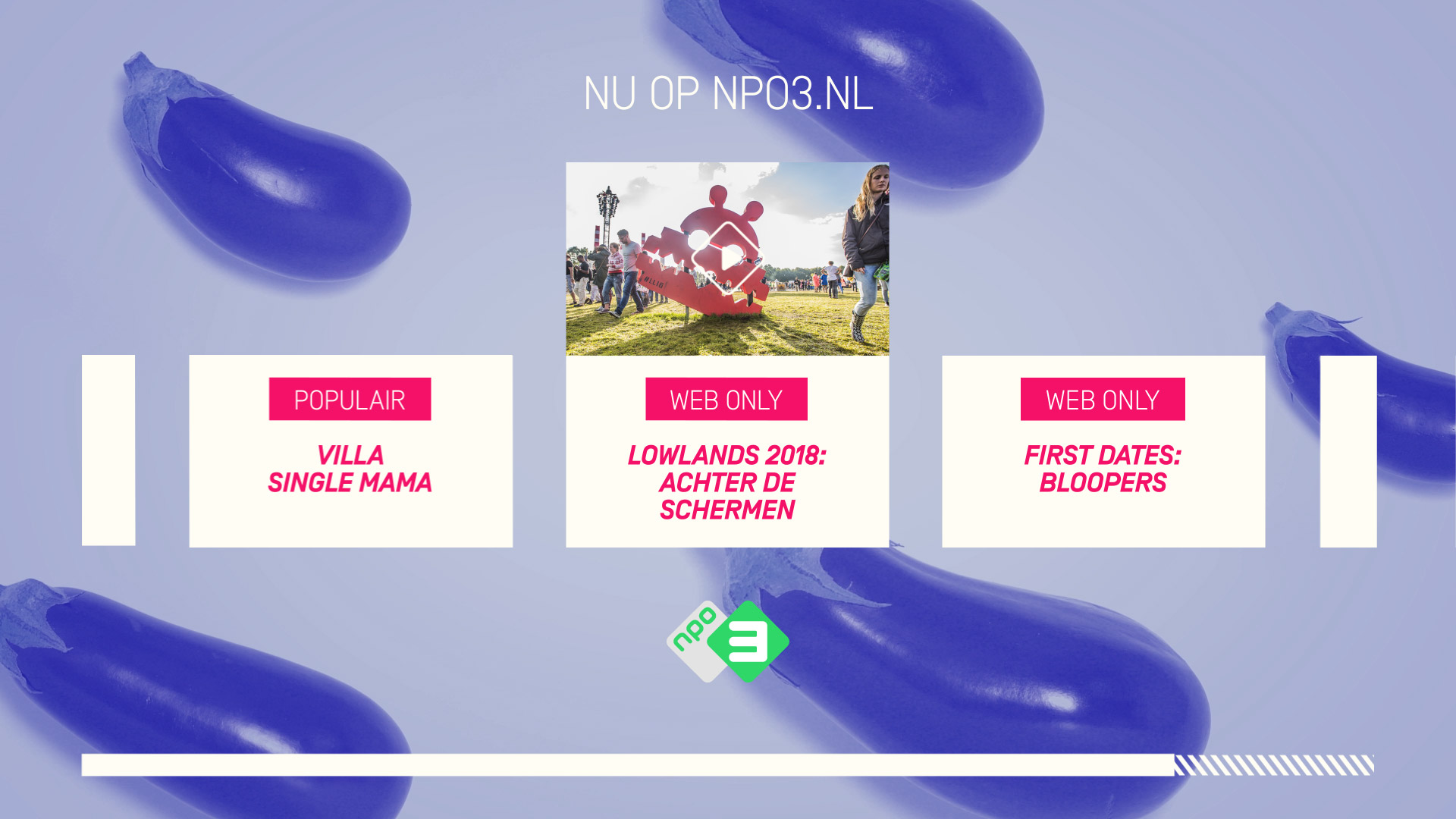
The NPO3 primary brand colour was updated to a fresh rgb version — to work better on mobile devices. Two extra brand colours were introduced to create clarity. Green is for brand messages, blue for tv navigation, while magenta is used to promote online content.
The NPO3 primary brand colour was updated to a fresh rgb version — to work better on mobile devices.
Two extra brand colours were introduced to create clarity.
Green is for brand messages, blue for tv navigation, while magenta is used to promote online content.
The NPO3 primary brand colour was updated to a fresh rgb version — to work better on mobile devices. Two extra brand colours were introduced to create clarity. Green is for brand messages, blue for tv navigation, while magenta is used to promote online content.
The NPO3 primary brand colour was updated to a fresh rgb version — to work better on mobile devices. Two extra brand colours were introduced to create clarity. Green is for brand messages, blue for tv navigation, while magenta is used to promote online content.
The NPO3 primary brand colour was updated to a fresh rgb version, to work better on mobile devices.
Two extra brand colours were introduced to create clarity.
Green is for brand messages, blue for tv navigation,
while magenta is used to promote online content.
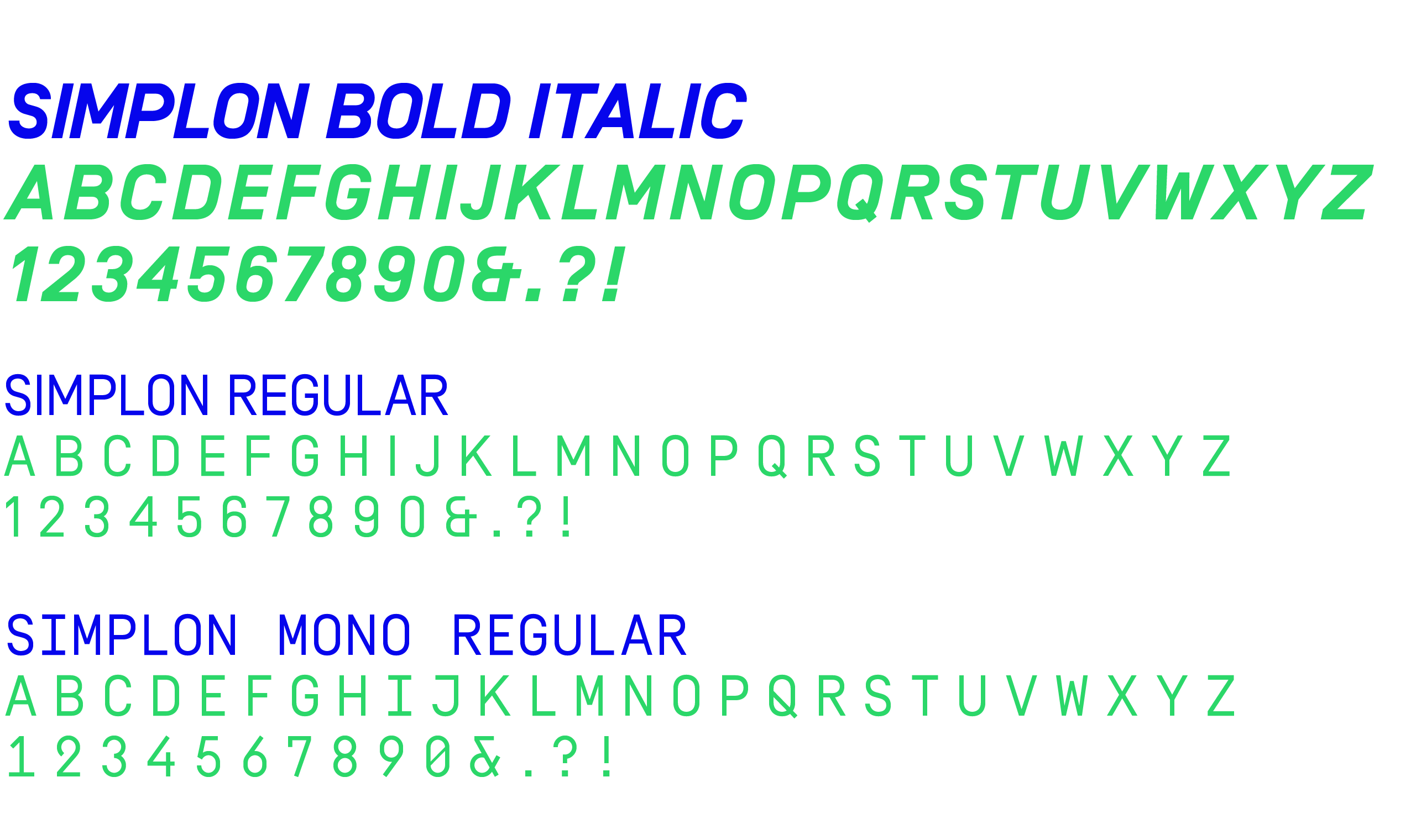
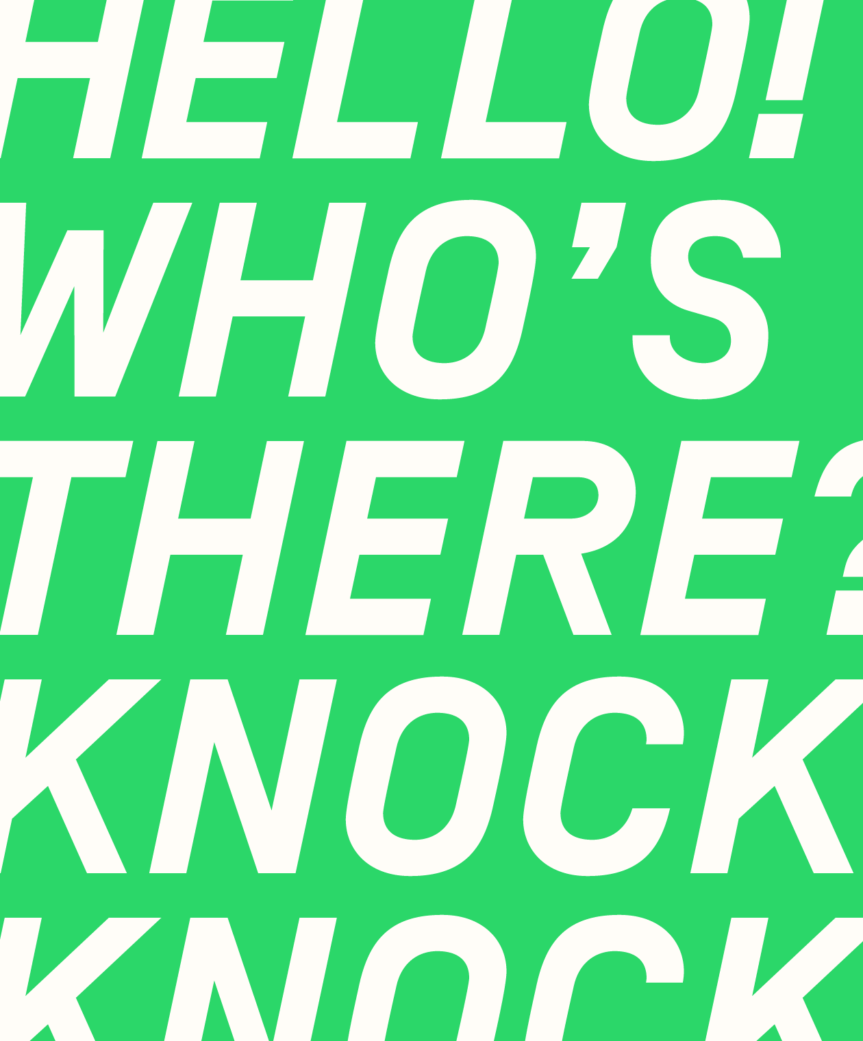
Clean and no fuss typography based around the Simplon typeface was introduced, making use of big and bold titles for increased readability on smaller screens, as well as bold brand shoutouts.
Clean and no fuss typography based around the Simplon typeface was introduced, making use of big and bold titles
for increased readability on smaller screens, as well as bold brand shoutouts.
Clean and no fuss typography based around the Simplon typeface was introduced, making use of big and bold titles for increased readability on smaller screens, as well as bold brand shoutouts.
Clean and no fuss typography based around the Simplon typeface was introduced, making use of big and bold titles for increased readability on smaller screens, as well as bold brand shoutouts.
Clean and no fuss typography based around the Simplon typeface was introduced, making use of big and bold titles for increased readability on smaller screens, as well as bold brand shoutouts.
Credits
Client: Total Design / NPO3
Sonic Branding: Massive Music
Created @ Woodwork Amsterdam
Client: Total Design / NPO3
Sonic Branding: Massive Music
Created @ Woodwork Amsterdam
Client: Total Design / NPO3
Sonic Branding: Massive Music
Created @ Woodwork Amsterdam
Simon van de Rijdt
Creative Direction & Brand Design